
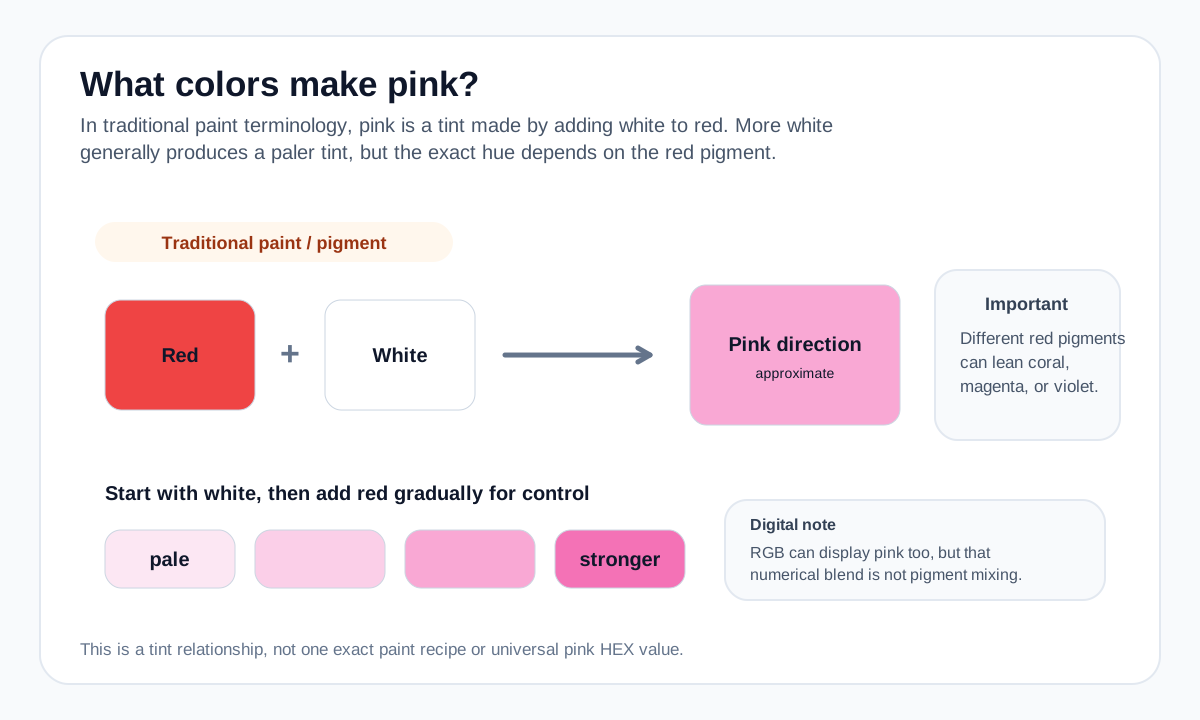
For paint, put down white first and introduce a small amount of red. Red is usually much stronger than white, so this approach makes it easier to stop at a pale or medium pink.
If you need a repeatable digital pink, choose the target HEX/RGB value directly. The Shades of Pink reference can help compare lightness levels before you settle on a value.
Practical mixing routes
- For paint, start with red and add white gradually until the lightness is where you want it.
- For screen design, choose a lighter red-family RGB/HSL value directly instead of treating the process as physical mixing.
How to adjust the result
Increase lightness and reduce saturation.
Keep more saturation and shift toward magenta if desired.
Reduce saturation with a neutral direction rather than only adding more white.
Common mixing mistakes
- Assuming every red plus white makes the same pink; red pigment bias changes the result.
- Using white only when the actual goal is a muted/dusty pink rather than a lighter pink.
- Treating a screen lightness change as a physical paint prediction.
Why the answer changes by color model
Adding white pigment creates a tint by increasing lightness and reducing the visual strength of the red. A digital RGB blend can create a pink screen color too, but it is a numerical light-value operation rather than pigment mixing.
Different red pigments can make pinks that lean orange, coral, magenta, or violet. The label “red” alone does not determine the exact pink.
For a numerical screen-color blend, use the Digital Color Mixer. Its result is an RGB interpolation and should not be treated as a prediction of real paint or ink behavior.
Source and model notes
- Winsor & Newton — Colour bias in paint mixing — Why pigment bias changes the brightness and character of real paint mixtures.
Useful next steps
Compare a screen-color blend in the Color Mixer, or explore more mixing answers.