
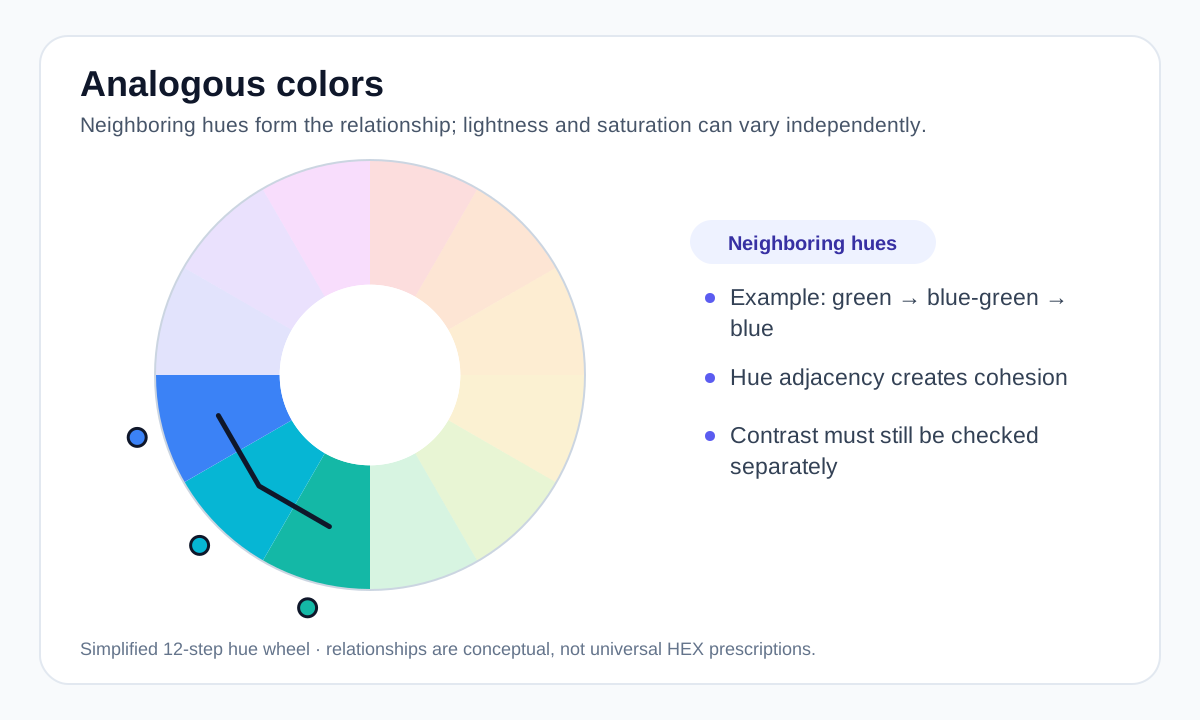
How analogous colors are arranged
An analogous scheme starts with one main hue and adds nearby hues on either side of it. A compact three-color example is blue, blue-green and green. A wider analogous range can include more neighbors, but the palette becomes harder to control as the hue span grows.
The relationship comes from hue position, not from matching brightness. Two analogous colors can still differ greatly in saturation and lightness, which is useful because those differences create hierarchy without breaking the underlying harmony.
A practical way to build an analogous palette
Choose one hue as the dominant color, then select one neighbor for support and another for accent. After that, adjust lightness and saturation instead of adding more hues. This keeps the palette recognizable while giving you backgrounds, borders, text-supporting darks and stronger accents.
For interface work, a common pattern is a pale version of the dominant hue for surfaces, a medium version for secondary elements, and a darker or more saturated neighboring hue for important actions.
- Start with three neighboring hues before expanding the range.
- Create hierarchy with lightness and saturation, not hue changes alone.
- Keep a neutral text color available when the analogous colors do not provide enough contrast.
Analogous does not automatically mean accessible
Adjacent hues can be visually similar, especially when their lightness is also similar. That can make text, icons or data series difficult to distinguish even though the palette looks harmonious.
Check contrast for the exact foreground/background pair and avoid using hue differences as the only signal for state or meaning. A harmonious palette can still include strong dark/light contrast.
When analogous colors are useful
Analogous palettes are especially useful when the design should feel connected rather than confrontational. They work well for calm product surfaces, editorial systems, illustration, wellness themes and nature-inspired palettes.
If you need stronger visual separation, a complementary or split-complementary accent can be introduced selectively rather than abandoning the analogous base.
Worked example: a cool analogous UI palette
Start with a blue primary and move to nearby cyan/green hues instead of jumping across the color wheel.
#2563EB Primary action #0891B2 Supporting accent #0D9488 Secondary accent #0F172A Neutral text The three colored accents stay relatively close in hue, while the neutral ink supplies stronger text contrast. That separation of hue harmony from text contrast is usually more useful than forcing every role to be analogous.
Useful tools
Sources and method
- Adobe — Colour wheel combinations — Color-wheel relationships including analogous, triadic, tetradic, warm and cool groupings.
- Adobe — Complementary colours — Complementary, analogous and triadic relationships and practical palette use.
- W3C WAI — Understanding Contrast (Minimum) — WCAG text contrast thresholds and guidance.