
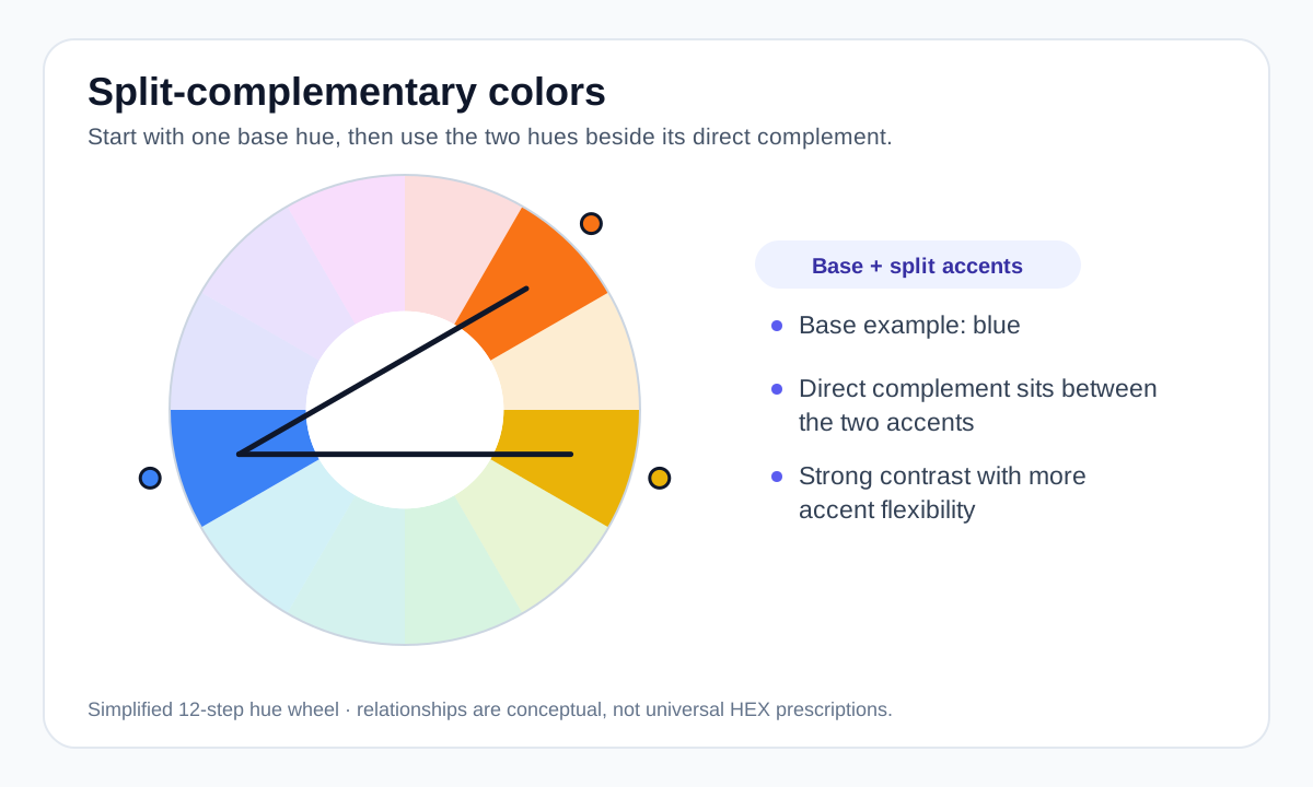
How to find a split-complementary scheme
Choose a base hue, identify the color directly opposite it on the wheel, then move one step to each side of that opposite color. If the base is blue, the split accents sit around the orange region rather than using one exact orange.
The precise hues depend on the color wheel model and the step size you choose, so the relationship is best treated as a design framework rather than a single universal set of HEX codes.
Why designers use it
Direct complementary pairs can feel very intense because the hues oppose each other strongly. Splitting the complement gives you more variety and often makes it easier to assign one accent for primary emphasis and another for supporting emphasis.
The base color can dominate most of the layout while the split accents appear in smaller amounts. That usually creates a more controlled result than giving all three hues equal visual weight.
Balance the palette before adding more colors
A useful split-complementary palette still needs tonal structure. Build light and dark variants, then test which colors can support text, surfaces and interactive states. Do not rely on the three hue relationships alone.
If the design becomes noisy, reduce saturation or use neutrals for large surfaces. The harmony relationship should guide accents, not force every component to be brightly colored.
Contrast and meaning
Color-wheel opposition does not equal WCAG text contrast. Two highly different hues can still have similar relative luminance. Measure the pair when text or essential icons are involved.
Likewise, do not assign meaning only through hue. Labels and other non-color cues are important when the colors represent states or categories.
Worked example: blue with split warm accents
A blue base can pair with warm accents on either side of its orange complement to create contrast without relying on one exact opposite hue.
#2563EB Dominant color #F97316 Primary warm accent #EAB308 Secondary warm accent #F8FAFC Surface Use the blue for most of the system and keep the warm colors smaller. The relationship is a design framework; final contrast still has to be measured on the exact pairs.
Useful tools
Sources and method
- Adobe — Colour wheel combinations — Color-wheel relationships including analogous, triadic, tetradic, warm and cool groupings.
- Adobe — Complementary colours — Complementary, analogous and triadic relationships and practical palette use.
- W3C WAI — Understanding Contrast (Minimum) — WCAG text contrast thresholds and guidance.