
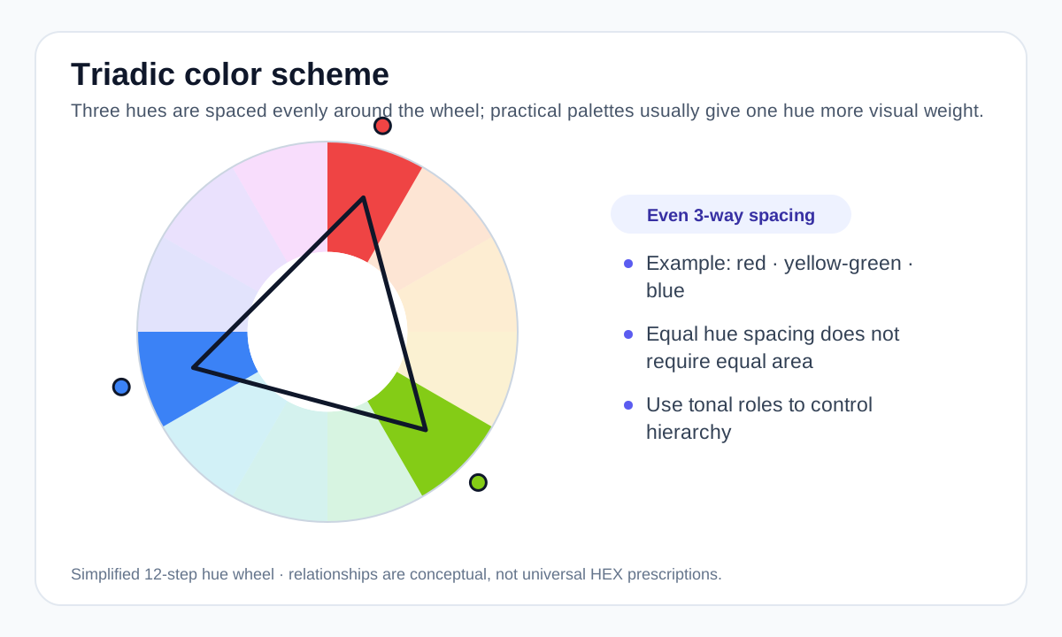
How triadic colors are arranged
Imagine three points forming an equilateral triangle on the color wheel. Classic examples include red, yellow and blue in a traditional wheel, or orange, green and violet as another evenly spaced set.
Different digital or artistic color-wheel models can place exact intermediate hues differently, so the useful principle is equal hue spacing rather than one mandatory set of HEX values.
Avoid giving all three hues equal weight
Three saturated hues can compete aggressively when they occupy similar amounts of space. A more practical approach is to choose one dominant hue, use a second for supporting elements and reserve the third for smaller accents.
You can also reduce saturation or raise lightness for large surfaces while keeping one stronger hue for important actions.
Build tonal roles around the triad
The hue relationship is only the first step. Create light, medium and dark variants as needed for surfaces, borders, text and controls. Neutral colors often help keep the scheme readable.
When the triad is used in charts, add labels or other distinctions so users are not required to separate categories by hue alone.
When triadic schemes fit
Triadic palettes suit projects that need multiple distinct color families while still feeling deliberately organized. They are common in playful branding, illustration, education and energetic editorial work.
For quieter interfaces, use a low-saturation triad or keep two of the three hues subtle.
Worked example: a controlled triadic direction
A practical triadic palette can preserve three distinct hue families while deliberately reducing the visual weight of two of them.
#2563EB Dominant #EF4444 Small accent #EAB308 Small accent #334155 Neutral structure The example is intentionally tuned for practical hierarchy rather than presented as a mathematically exact equal-saturation wheel. The neutral prevents three saturated families from competing everywhere.
Useful tools
Sources and method
- Adobe — Colour wheel combinations — Color-wheel relationships including analogous, triadic, tetradic, warm and cool groupings.
- W3C WAI — Understanding Contrast (Minimum) — WCAG text contrast thresholds and guidance.