
Harmony is more than choosing the right hues
Color-wheel relationships explain how hues are positioned relative to each other, but they do not automatically create a finished palette. Two technically harmonious hues can still compete if both are highly saturated and used in equal amounts.
A working system also needs hierarchy: which color is dominant, which supports it, which is reserved for accents and which neutrals carry text or surfaces.
Common harmony structures
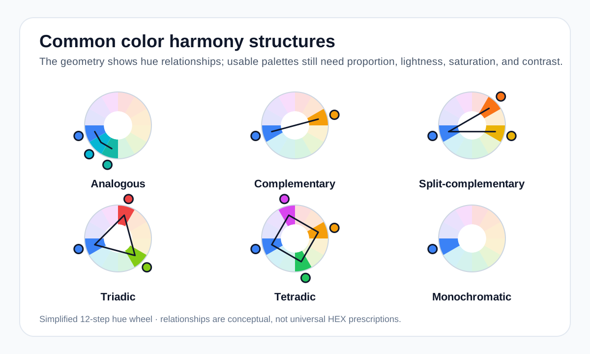
Analogous schemes use neighboring hues. Complementary schemes use opposing hues. Split-complementary schemes replace the direct opposite with the two adjacent hues. Triadic schemes use three evenly spaced hues, while tetradic schemes use four structured hues. Monochromatic schemes stay inside one hue family.
These are frameworks, not strict recipes. You can tune saturation and lightness while preserving the underlying relationship.
- Analogous: cohesive and closely related.
- Complementary: strong opposition and emphasis.
- Split-complementary: contrast with more flexibility.
- Triadic: three-way balance and energy.
- Tetradic: broad variety with higher coordination cost.
- Monochromatic: one hue with tonal variation.
Proportion changes the result
A palette can feel very different depending on how much of each color is visible. A bright accent that occupies five percent of a layout can feel controlled; the same accent covering half the screen may dominate everything else.
This is why palette previews should be tested in realistic components, not only as equal-width swatches.
Measure contrast separately from harmony
Harmony describes visual relationships; WCAG contrast describes readability between foreground and background. A pair can be harmonious but unreadable, or visually tense but highly readable.
Use both concepts: choose relationships for visual structure, then measure critical text and control contrast independently.
Worked example: harmony plus role assignment
Color harmony becomes more useful when each color has a job instead of appearing as equal-width swatches only.
#F8FAFC Background #5B5CF0 Action #2DC8E8 Secondary accent #FFB13B Small highlight #111827 Text The result is not “harmonious” because of one formula alone. Proportion, lightness, saturation, and role assignment are doing as much work as the hue relationships.
Useful tools
Sources and method
- Adobe — Colour wheel combinations — Color-wheel relationships including analogous, triadic, tetradic, warm and cool groupings.
- Adobe — Complementary colours — Complementary, analogous and triadic relationships and practical palette use.
- W3C WAI — Understanding Contrast (Minimum) — WCAG text contrast thresholds and guidance.