
What makes a scheme monochromatic
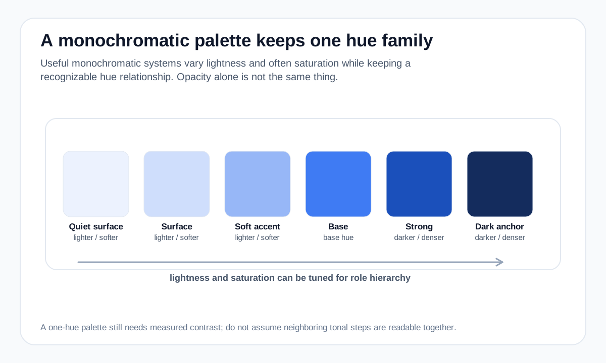
The defining feature is a shared hue family. You might begin with a blue, then create pale blue surfaces, a medium blue accent and a deep blue anchor. The visual system stays unified because the colors remain recognizably related.
In practice, designers often adjust both saturation and lightness. That produces more useful steps than changing opacity alone, because transparent colors depend on whatever background sits underneath them.
How to create useful depth
Start with one base color and decide which jobs the palette must perform: background, subtle surface, border, secondary accent, primary action and dark anchor are common roles. Generate candidate steps, then tune them individually instead of assuming evenly spaced numeric values will look evenly spaced.
A light tint can create a quiet surface, the base hue can carry brand identity, and a darker shade can supply stronger contrast. Neutral text can still be used when the hue family cannot provide a readable text color.
- Use lightness to separate surfaces and hierarchy.
- Reduce saturation when a step feels too intense.
- Do not force every role, especially body text, to use the base hue.
Monochromatic versus grayscale
Grayscale is achromatic: it uses no hue. A monochromatic palette can include near-neutral steps, but its identity comes from a chosen hue. A blue monochromatic system and a gray system may share similar lightness structure while feeling very different.
This distinction matters in data visualization and UI design because hue can carry brand character while lightness carries hierarchy.
Accessibility checks still matter
One-hue palettes can accidentally produce adjacent values that are too similar. Test text contrast and make sure interactive states differ through more than subtle color shifts.
For charts or status indicators, add labels, patterns, shapes or clear spacing so meaning does not depend only on neighboring tonal steps.
Worked example: one blue hue, multiple jobs
A monochromatic system becomes more useful when the same blue family is assigned different lightness roles.
#EFF6FF Very light background #BFDBFE Subtle state #60A5FA Supporting accent #2563EB Action #1E3A8A Dark anchor The palette remains recognizably blue, but the steps are not merely the same color with opacity. Each value is chosen to perform a different visual job.
Useful tools
Sources and method
- Adobe — Colour wheel combinations — Color-wheel relationships including analogous, triadic, tetradic, warm and cool groupings.
- W3C WAI — Understanding Contrast (Minimum) — WCAG text contrast thresholds and guidance.