
The basic warm/cool grouping
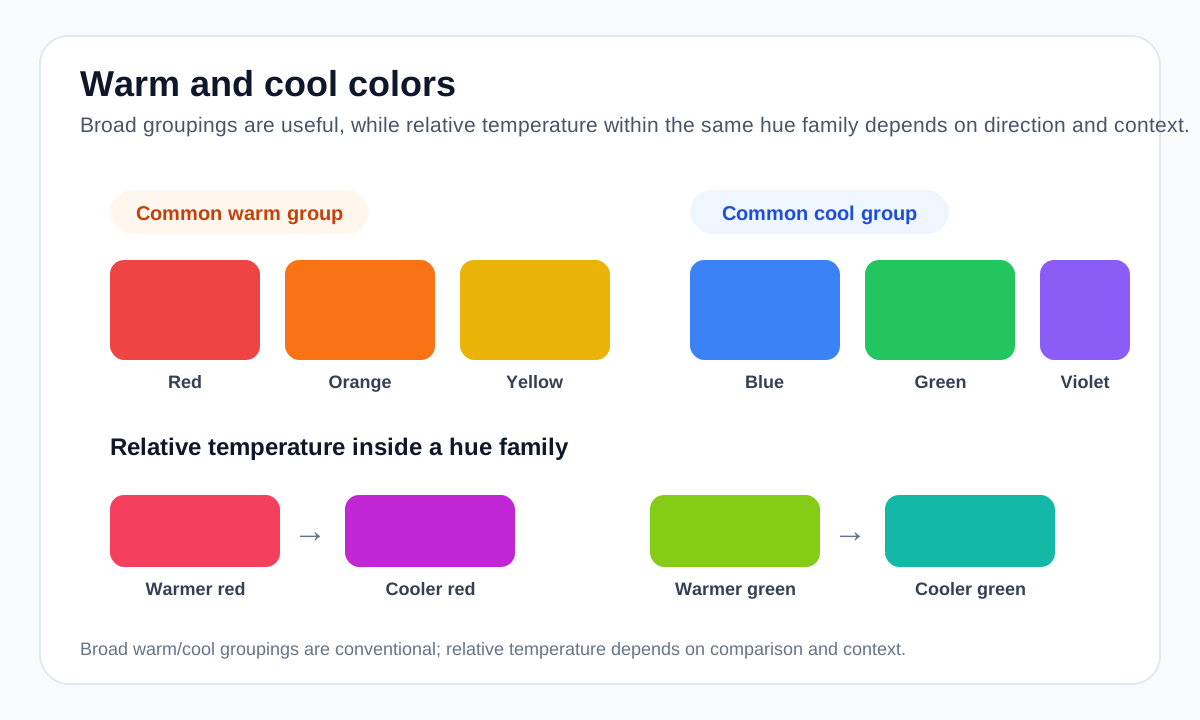
On a simplified color wheel, reds, oranges and yellows are usually described as warm, while blues, greens and violets are described as cool. This gives designers a quick vocabulary for comparing broad hue families.
The grouping is not a physical temperature measurement. It is a visual and cultural convention that helps describe relationships between hues.
Temperature is also relative within a hue
A red that leans toward orange often reads warmer than a red that leans toward magenta. A green that leans toward yellow can read warmer than a blue-green. This relative comparison is often more useful in real palette building than labeling every hue absolutely warm or cool.
Saturation, lightness and surrounding colors also affect perception. The same color can feel different when placed beside a warmer or cooler neighbor.
How to use temperature in a palette
A mostly cool palette can use a small warm accent to create focus, while a mostly warm palette can use a cool accent to create separation. Another approach is to stay inside one temperature family for a more unified atmosphere.
For interface systems, temperature should not replace hierarchy. Lightness contrast, spacing, typography and component state remain the more dependable tools for readability and structure.
Warm/cool does not determine accessibility
A warm color is not automatically more visible than a cool color, and vice versa. Accessibility depends on measurable contrast and other cues, not the temperature label.
If text is placed on a colored surface, test that exact pair. If color communicates state, include labels, icons or patterns where appropriate.
Worked example: temperature as emphasis
A mostly cool interface can use one warm color to pull attention without changing the entire palette.
#1E3A8A Cool anchor #2563EB Cool primary #0D9488 Cool support #F97316 Warm focal accent Temperature helps create emphasis, but the orange does not become automatically accessible just because it contrasts in hue. Text and control contrast remain separate checks.
Useful tools
Sources and method
- Adobe — Colour wheel combinations — Color-wheel relationships including analogous, triadic, tetradic, warm and cool groupings.
- W3C WAI — Understanding Contrast (Minimum) — WCAG text contrast thresholds and guidance.